Pereira Services Group
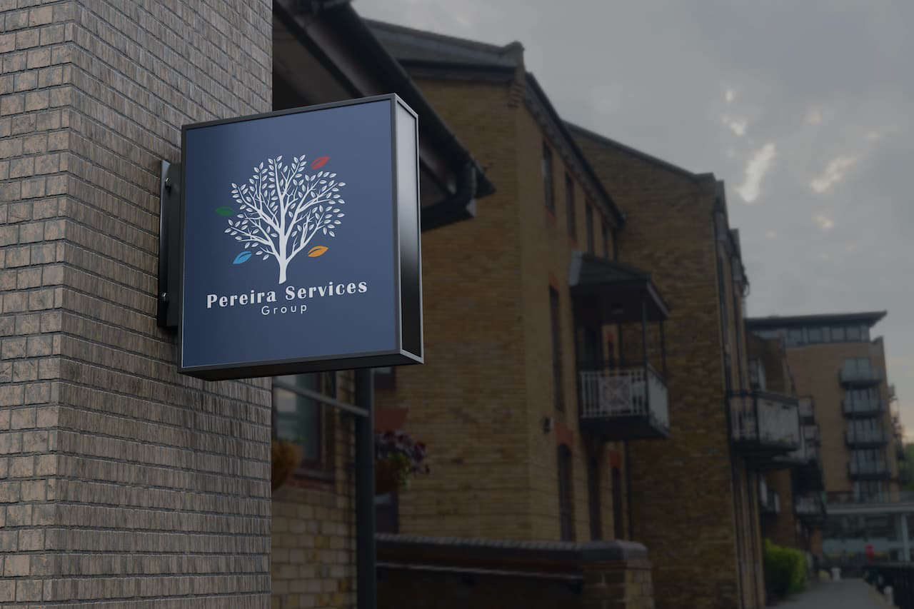
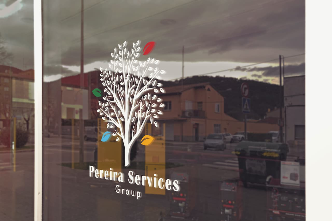
The goal of the Pereira Services Group project was to create a strong brand identity for a family business that offers real estate, property management, and topographic services. Our task was to design a logo that would represent the different business areas associated with color, with each color reflecting a different area.
The logo design was inspired by a tree with falling leaves, representing the diverse range of services offered by the business. We ensured that the logo as a whole reflected the values of a family business, with a sense of community and warmth. Our team used Illustrator to design the logo with different colors to represent the business areas, and to give the logo a modern, professional look.
Our team carefully selected the color scheme for each business area to create a cohesive and strong brand identity for the group. Overall, the Pereira Services Group project resulted in a brand identity that was versatile and adaptable to different mediums, with a logo that represented the values of a family business.


